Kitchen Upgrade v2!
SMASHED POTATOES » Devlog

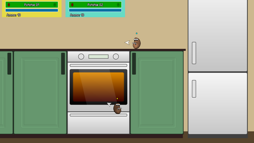
I started to work on the graphics a bit. This style might be a bit too sterile, I don't know. I will see how it looks when I finish the kitchen. For now I like it.
I also added a SlowMo bar, now the players can only slow down the time when their bar is filled.
Lastly, I added a handy little marker, which shows in what direction is the ammo box, when it is out of screen.
SMASHED POTATOES
Fast paced 2D deathmatch
| Status | In development |
| Author | sztrovacsek |
| Genre | Action |
| Tags | 2D, Character Customization, Cute, deathmatch, Fast-Paced, Local multiplayer |
| Languages | Czech, German, English, Spanish; Castilian, Finnish, French, Hungarian, Italian, Polish |
| Accessibility | Textless |
More posts
- It's cancelledn't!Jan 10, 2023
- Game cancelled?Sep 30, 2020
- Feedback topicJan 01, 2020
- Early Acces!Dec 31, 2019
- Mr. Potatoe who?Nov 30, 2019
- Polyglot PotatoesNov 20, 2019
- Little Update 2Nov 13, 2019
- Fancy Shmancy PotatoesNov 06, 2019
- Kitchen Upgrade!Oct 04, 2019
Comments
Log in with itch.io to leave a comment.
Hey more updates :)
I've been a bit busy so I think I missed a few things it seems :p
Considering the theme you're going for, a kitchen arena really is a good place to start XD, i really like the fact that you made the play area more than just the top of the stove and "table" and its a nice detail to have the oven's handles as platforms.
Art wise i'd say it looks nice, simplicity can be a good thing here it's cohesive with the rest of your design :) the only thing i'd point out would be to improve readability, would be to have your background elemens (the oven fridge etc...) be a bit more faded, and have more emphasis on the "handles" and "top of the table" so that you can identify what's a platform more easily (since your game will probably be more about fast pace battles with quick thinking) Otherwise it's a nice improvement from what i see from the previous style you seem to have had for the kitchen ^^
The slight randomization of the arena is really a nice system, and the color coding as well as the ammo indicator to find the next ammo box when not in view are really neat details to improve player feedback.
Your game is taking shape and looking good, keep up the good work cheers ! :)
Thank you! :)
"the only thing i'd point out would be to improve readability"
Good point, it's easy to overlook things like this, when I'm spending hours and hours in game, so I can almost navigate with my eyes closed... :D
I will add some drop shadow below them, also make them a bit shinier at the top.
Yeah, it starts to look/feel like how I imagined, the more features I add, the more excited I'm about the development! :)
yeah, dropshadows would work fine though to highlight platforms a bit more
and cool to here things are going smooth and your game shapes up as you invisioned :)