Mr. Potatoe who?

Greetings!
The character creator is finally back! It's still not a final version, but at least it's working. I'm not complaining... :D
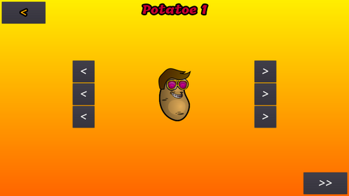
What can it do? - you ask. Well, for now, you can change your character's hair, glasses and mouth/mustache. There are not many options to choose from yet, tho. I just need to find a day, when I can draw hundreds of them.
The characters got some under the hood updates too. Now, if they carry a weapon, they are a bit slower, and can't jump as high as without a weapon. And after they got killed they have a visible aura, which indicates that they are in an invulnerable state.
In other news, I tweaked the menu system a bit. It's kind of in a zombie state now, looks bad, but under the rotten skin, there is a good heart. You can choose the length of the match (in minutes), so it's not going on for all eternity now, the time is displayed at the bottom center of the screen. Oh, and there is a (not quite) fancy endscreen as well.
That's it for today, enjoy!
(Also, if you like this project, you can buy me a ko-fi here: https://ko-fi.com/sztrovacsek Thanks!)
Files
SMASHED POTATOES
Fast paced 2D deathmatch
| Status | In development |
| Author | sztrovacsek |
| Genre | Action |
| Tags | 2D, Character Customization, Cute, deathmatch, Fast-Paced, Local multiplayer |
| Languages | Czech, German, English, Spanish; Castilian, Finnish, French, Hungarian, Italian, Polish |
| Accessibility | Textless |
More posts
- It's cancelledn't!Jan 10, 2023
- Game cancelled?Sep 30, 2020
- Feedback topicJan 01, 2020
- Early Acces!Dec 31, 2019
- Polyglot PotatoesNov 20, 2019
- Little Update 2Nov 13, 2019
- Fancy Shmancy PotatoesNov 06, 2019
- Kitchen Upgrade v2!Oct 12, 2019
- Kitchen Upgrade!Oct 04, 2019
Comments
Log in with itch.io to leave a comment.
Cool ! The long awaited potato creator is here XD and it's awesome, all it needs now is more stuff ^^
Also cool to see the localisation in quite a few languages, the only thing i'd say needs some fixing hre are the menus, the buttons and all look good, buth the scrolling menus are too small and barely readable, but nothing that can't be fixed, other than that looks good really, the font suits the overall style.
Really taking shape now keep up the good work :)
Thanks! :D
More stuff will come, don't worry, and I'll fix the current ones as well, because most of them are just quick sketches to test it out... :D
Yeah, the menus are ugly AF now, I know... :D First, I like to make sure that they are working correctly, and if everything is fine, then I'll do the graphics. :)
Most of the technical stuff are done, now I just need to add more levels, weapons and stuff for the character creator (and some actual music).
Haha well no problem witch quick sketches, especially since i understand your approach of technical stuff first and making assets later XD
Menus are not ugly though the buttons with the same font as your UI is cool it's just the "unfolding" menus but mostly cause the text is tiny, and i imagine this is part of things you have as placeholders for now, but anyway like i said looking good, keep it up :) and also sorry for the late reply i was busy ^^'
Yep, everything menu related is still a placeholder.
And no worries, I'm not your boss... xD